In the past year or so I did a lot of work on public-interest tech and data projects. I was so busy writing code, designing systems and hiring people that I failed to write anything at all about why these projects were worthwhile, and the sort of design and engineering challenges I had to overcome.
If you’re even slightly into projects that use data and coding for public good, I hope you’ll find this write-up at least mildly interesting!
Work for Private Eye
Once in a while, a dream project comes along. This was the case when a Private Eye journalist called Christian Eriksson wrote to say that he’d obtained details of all the UK properties owned by overseas companies via FOI, and wanted help with the data. This is how I came to build the Overseas Property map for Private Eye, which lets you see which of your neighbours own their property through an overseas company. I’ll write more the tech side of this separately at some point, but essentially the map shows 70,000 properties, two-thirds of which are owned in tax havens.
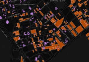
Christian and fellow Eye hack Richard Brooks wrote more than 30 stories about the arms dealers, money launderers and tax avoiders hiding property via these companies – the stories eventually became a Private Eye Special Report. The map was discussed in Parliament, written up in the FT, and the government eventually released the same data publicly.
This December, the investigation and map were nominated for the British Journalism Awards, in the ‘digital innovation’ and ‘investigation of the year’ categories, so I got to go to a fancy awards party. (Not too fancy – the goodie bag consisted of some nuts and a bottle of Heineken.) We were highly commended in the ‘digital innovation’ category, which was nice.
I also worked on another project for Private Eye. Freelance journalist Dale Hinton spotted that some local councillors (amazingly!) choose not to pay their council tax, and dug out the numbers across the country. Then the Eye’s Rotten Boroughs editor, Tim Minogue, suggested mapping the data. The resulting map just shows the number of rogues in each council. There were some creative excuses from the rogues, but my favourite was the councillor who admitted simply: “I ballsed up”.
Tech lead at Evidence-Based Medicine DataLab
My day job for most of 2016 was as tech lead at the Evidence-Based Medicine DataLab at the University of Oxford. This is a new institution set up by the brilliant Dr Ben Goldacre (of Bad Science fame). Evidence-based medicine uses evidence to inform medical practice, and the Lab aims to extend that by helping doctors use data better. I was the first hire.
As you might expect, this was a fascinating and rewarding job. I led on all the technology projects, collaborated on research, and helped build the team from 2 to 9 full-time staff, so a big chunk of my year was spent recruiting. In many ways 2016 was the year when I stopped being ‘just a coder’, and started to learn what it means to be a CTO. Here are some of the projects I worked on.
OpenPrescribing
I got the job at EBM DataLab on the strength of having been the sole developer on OpenPrescribing, collaborating with Ben and funded by Dr Peter Brindle at West of England Academic Health Sciences Network. This site provides a rapid search interface, dashboards and API to all the prescribing decisions made by GPs in England & Wales since 2010. Basically, it makes it easier to see which medicines were prescribed where.
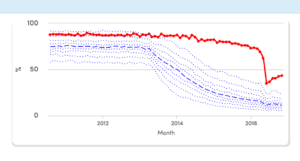
The big challenge on this project was design and UX. I interviewed doctors, prescribing managers and researchers, and we ended up with dashboards to show each organisation where it’s an outlier on various measures – so each GP or group of GPs can quickly see where it could save money or improve patient care.
The charts use percentiles to allow users to compare themselves with similar organisations, e.g. here’s how the group of GPs in central Birmingham used to prescribe many more expensive branded contraceptive pills than similar groups elsewhere, but improved things recently:
There’s also a fast search form for users who know what they’re looking for, and an API that lets researchers query for raw data files. Technically, it’s a Postgres/Django/DRF back-end, and JavaScript front-end with Highcharts to render the graphs (code here).
The raw data files are so unwieldy that previously (we were told) they were only really used by pharma companies, to check where their drugs were being under-prescribed and target marketing accordingly. In fact, we heard that lobbying from pharma was what got the NHS to release the open data in the first place!
OpenPrescribing was also an interesting technical challenge, because the dataset was reasonably large (80GB, 500 million rows), and users need to run fast queries across all of it. Since I didn’t have millions to give to Oracle, which is what the NHS does internally, I used Postgres for our version. With a bit of love and optimisation, it was all performant and scaled well.
Writing papers with BigQuery
As well as building services, EBM DataLab writes original research. Over the year I co-authored three papers, and wrote numerous analyses now in the paper pipeline. I can’t go into detail since these are all pre-publication, but they’re mostly based on the prescribing dataset, about how the NHS manages (or doesn’t) its £10 billion annual prescribing budget.
Probably the most enjoyable technical aspect of last year was setting up the data analysis tools for this – well, I’m not going to call it ‘big data’ because it’s not terabytes, but let’s say it’s reasonably sized data. I set up a BigQuery dataset, which makes querying this huge dataset fast, and as simple as writing SQL. Then I connected the BigQuery dataset to Jupyter notebooks, writing analyses in pandas and visualising data in matplotlib – I highly recommend this setup if you’ve got big reasonably sized data to analyse.
Tracking clinical trials
Another project was TrialsTracker, which tracks which universities, hospitals and drug companies aren’t reporting their clinical trial results. This matters because clinical trials are the best way we have to test whether a new medicine is safe and effective, but many trials never report their results – especially trials that find the medicine isn’t effective. In fact, trials with negative results are twice as likely to remain unreported as those with positive results.
The TrialsTracker project tries to fix this by naming and shaming the organisations that aren’t reporting their clinical trials. This was Ben’s idea, and I wrote the code to make it work. It gets details of all trials registered on clinicaltrials.gov that are listed as ‘completed’, and then checks whether their results are published either there or on PubMed using a linked identifier (so a researcher can find them easily). Then it aggregates the results by trial sponsor, showing the organisations with the worst publication record:
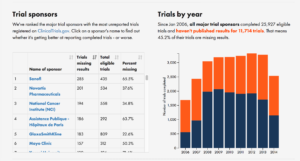
My approach to this was minimum viable product: it’s a simple, responsive site that clearly lays out the numbers for each organisation, and provides an incentive to publish their unpublished trials (since the data is updated regularly, if they publish past trials, their position in the table will improve over time). We wrote a paper on it in F1000 Research, the open science journal, and the project was covered in the Economist.
The best part of this project was getting numerous mails from researchers saying “this will help me lobby my organisation to publish more”. Yay!
Other projects
I also worked on the alpha of Retractobot (coming soon), a new service to notify researchers when a paper they’ve cited gets retracted. This matters because more and more papers are being retracted, yet they continue to get cited frequently, so bad results go on polluting science long after they’ve been withdrawn. And I built the front-end website for the COMPare project – this is a valiant group of five medical students, led by Ben, who checked for switched outcomes in every trial published in the top five medical journals for six weeks, then tried to get them fixed. (Spoiler: the journals were NOT happy.) Here’s more about COMPare.
Onwards!
After just over a year at EBM DataLab, I decided to move on to pastures new at the end of 2016. I’d had a lot of fun, but the organisation was now stable and mature, and I was keen to explore other interests outside healthcare. I’ve left the tech side of things in the highly capable hands of our developer Seb Bacon, previously CTO at OpenCorporates.
Since then, I’ve been having fun working through a list of about 25 one-day coding and data analysis side projects (of the kind you always want to do, but never have time). These side projects include: several around housing and land, including with Inside AirBNB’s data; statistical methods for conversion funnels; building an Alexa skill; setting up a deep learning project with Keras and Tensorflow to classify fashion images; more work on dress sizing data; and a few data journalism projects.
Longer-term, I’m thinking of joining an early-stage venture as tech lead. If you’d like to chat about the above, or just about anything related to coding, stats or maps, I’m always keen to have coffee with interesting people: drop me a line.